Big data Analytics is the new buzz in town. It is every big data analysts’ dream to analyze data, big or small, and get insights into things that were previously unseen by others. And now we have the tools — software and hardware — to analyze large amounts of data in a way that leads to meaningful and sometimes actionable analytics.
However, data is only as valuable as the analysis one performs on it, and Analytics is only as insightful as the person doing the analysis. The main function of a Data Analyst is to derive actionable analytics from the swath of data available. Sometimes, the same data can be analyzed by different analysts reaching different conclusions – quite possibly contradictory conclusions. There are many reasons that might lead to this contradiction. I thought it would be a good idea to list some cautions on any exercise of data analysis, big or small.
Even a broken clock is right twice a day
As stated earlier, the analytics derived from data is only as insightful as the analyst performing it. As an analyst looking for patterns in data, you will encounter several apparent hits. While it is exhilarating to see patterns emerge from data analysis, it is just as important to look further to see if the emergent pattern is indeed a real-world pattern or just a statistical anomaly.
More often than not, emergent patterns are just that — patterns that appear in small segments of a larger data set. If patterns appear sporadically or sparsely, it is most likely a false positive. Large data sets inherently contain statistical anomalies. In fact, the bigger the data, the higher the probability that improbable (and consequently inaccurate) patterns are hidden in smaller subsets of the larger dataset.
Even a broken clock is right twice a day, and if you happen to check the time at those right times, you will wind up thinking that the clock was working.
Climate is not weather
I am always mildly amused by people who say things like “It’s so cold today; so much for global warming”. While I get that it is just a joke, the undertone in the statement clearly points to a lack of understanding in the difference between weather and climate, or more generally, perceiving apparent patterns in really random or unrelated events.
Science spokesperson and astrophysicist, Neil deGrasse Tyson drops some knowledge in this video below, a segment from his TV Show, Cosmos.
Courtesy: National GeographicKeep your eye on the man, not the dog!
The point to take home is that, at smaller scales, the data might look either haphazard or manifest a specific pattern. However, applying a broader context may reveal another pattern, one that is quite different.
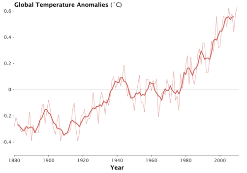
In the chart below (courtesy NASA Goddard Institute for Space Studies), the lighter line represents annual global temperatures, and the darker thicker line represent the 5 year running mean. If you focus on the thinner line, you will notice that patterns are haphazard. There are three years between 2000 and 2010 where the temperature is actually cooler than 1998. However, the thicker line which averages the 5 years around the data point shows a clear rise in temperature over the past couple of decades. Yet again, the thicker line also shows the temperatures flattening out in the last decade. It’s easy to see why one would just observe the last decade and claim the global temperatures have flattened. But upon closer inspection in a broader context, there have been similarly sized flattening happening in the 80s and 90s. The bigger picture from 1960 to 2010 is one of clear and undeniable growth.
Source: NASA Goddard Institute for Space Studies (http://www.giss.nasa.gov/)Applying a broader context is an essential part of data analysis. Keep your eye on the man, not the dog!
Correlation does not imply causation
This phrase is very often used in statistics, almost to the point that it is common sense in the data analysis community. Despite that, it is often an overlooked occurrence.
A correlation between two variables, no matter how strong they appear, need not necessarily mean that one has a causal relationship with the other. In fact, it does not necessarily even mean that one has any relationship to the other.
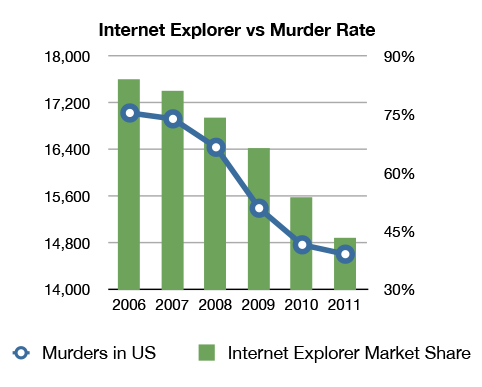
As shown in this comical chart below, there seems to be correlation between Internet Explorer usage and number of murders in the U.S. But it does not make any sense in the real world.
Courtesy: Geek.com (http://www.geek.com/microsoft/does-internet-explorers-falling-market-share-mirror-the-drop-in-us-homicides-1537095/)I am not sure if the data behind this chart is accurate, and I have no reason to believe one way or the other. However, I have no reason to believe that these two phenomena are even related, let alone one causes the other. Surely, it’s absurd to state that as people start using IE less they murder less, or the reverse, that as murder rates fall so does IE usage. However, the data seems to support these assertions.
While this example is patently absurd, there are many cases, where it might seem likely that there is a relationship. It is best to keep this catchphrase in the back of your minds: Correlation does not imply causation.
An extreme version of this catchphrase goes to the extent of saying that Causation can never be determined by analytical means, and should be left to the realm of philosophy. Correlation is good enough, as long as the corresponding hypothesis can be validated by its power of predictability. It essentially means that if a correlation is noted, and it is repeatable and predictable, then it is not required to prove the causality aspect of the correlation.
While it is important to understand that correlation does not imply causation, a strong correlation is sufficient to make effective business decisions. True causality is certainly a curiosity, but one that is quite unnecessary in the context of business intelligence.
A picture is worth a thousand numbers, or a couple of terabytes
While computers are very powerful number crunchers, we humans are far superior visual analyzers, at least as yet. Computers can analyze visual data, but they do so, by and large, by converting the graphical data into numerical equivalents.
We certainly should use the power of computational data analysis. At times though, there is nothing better than the good old staring-at-a-chart data analysis. This is not because of any inherent problem with computational methods. Instead, it is because of the simple fact that computers do what the data analyst asks it to do. The problem is when the data analyst does not know what to ask for.
Computational (statistical) tools like Standard Deviation and Linear Regression, while powerful in their own right, are not suitable to spot blips or spikes in otherwise smooth data, unless one knows to look for it. Plot it on a chart, and the human eye will catch it in a blink. Again, I am not arguing that looking at charts is the best way of looking for blips. If you know you’re looking for a blip, it is really easy to have the computer look for it for you. But, in case you didn’t know what irregularities exist in your data, it’s better to plot it on a chart, and let the human eye/brain look for them.
There are many tools that let you plot your data. Microsoft Excel is a good place to start.
Follow the data; don’t make the data follow you
Almost every exercise in data analysis starts with a hypothesis. Although it would be ideal to perform research with a blank slate and come to conclusions after the analysis, it is almost inevitable that you will start with a hypothesis. In fact, in statistical inference, one starts with a null hypothesis.
The problem is in setting up scientific experiments or performing data analysis with the intention of proving a hypothesis. This is where confirmation bias kicks in. The level of attachment you have to your hypothesis determines how many data points you observe that prove you’re right. This is reminiscent of an adage President Obama used during his 2008 Presidential campaign: “If all you have is a hammer, every problem looks like a nail.”
There is a saying in the scientific community, and I paraphrase: if you have a hypothesis and you want to know if it’s true or false, then do not set up your experiments to prove that it is true. Instead try to prove that it is false. And if you can’t, then it may be true.
Also, always remember: You can never prove that a non-trivial hypothesis is true. You can either prove that it is false or that it is not false.


Leave A Comment